Benjamin Moore Color Company
  • Home
  • tintitlater Store
  • Home Delivery
  • Download Colour Decks
  • BM 2022 Colour Trends
  • About Us
  • Contact
  • covid 19 Updates
  • Sales & Promotions
  • VIP List

Our Blog
​

SPRING IS IN THE AIR

3/9/2018

9 Comments

 
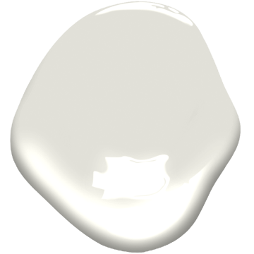
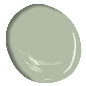
​     I don't know about you but I am so looking forward to warmer weather. Driving from out of town in the freezing ​cold and blizzardy weather was never on my bucket list. And yet I've done it more times this year than I can remember. 
     Lets talk Spring! When the snow starts melting and the birds start appearing it gets us in the spirit to freshen things up. Growing up we had a week long "spring cleaning session". Every day I had to pick something off the list to deep clean. Now as an adult I actually look forward to it. Along with cleaning I often like to freshen up one or two rooms in my home.  
     Choosing the right colour for your space can be very difficult for some people. The lighting in their home and surrounding furniture play a huge roll in what the colour looks like in their space. Jut recently I suggested Collingwood to some friends who were repainting their kitchen. From what they described they were looking for it seemed like the perfect fit. We mixed up a sample and tried it out. It looked dark with a hint of Mauve in it! Not at all what it looked like at the store or on the walls at my house. 
     Buying a sample pot or bringing the chip home is something we highly recommend when choosing a colour. Here are a few colour ideas to brighten up your space this spring. Happy Spring Painting!
​
Picture

Intense White OC-51

Picture

Salisbury Green ​HC-139

Picture

Portland Gray ​2109-60

9 Comments

CHOOSING THE RIGHT TOOLS FOR THE JOB

2/2/2018

0 Comments

 
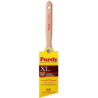
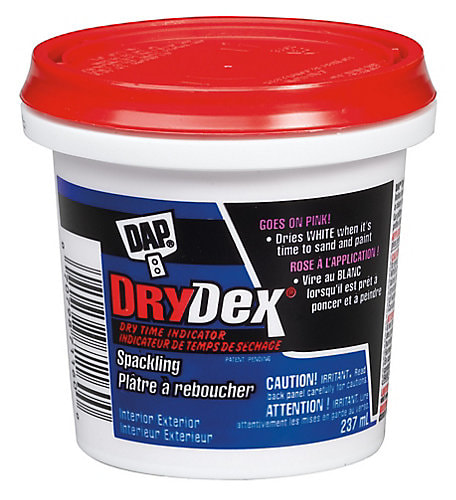
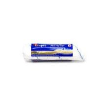
​We have lots of customers who tell us they've tried all kinds of paint. But, once they've tried ours they've never gone back. Choosing the best quality paint is definitely step one but the second step is choosing quality tools to get the paint on to the walls. Using a roller from the dollar store to apply a quality paint is like cleaning your leather sofa with bleach. Sure your sofa will be clean but the end result will end up leaving your beautiful sofa looking like a bad tie-die job. Probably not what you had in mind. When you use low quality products to apply our paints your finished product won't have the end result you had in mind. 
When picking up your paint be sure to ask whoever is serving you to show you what tools are right for your job. Here are a few of our favorite applicators and tools.
Picture
A Purdy Brush not only leaves an exceptional finish, but if you care for it correctly a Purdy Brush can last you 10+ Years.

Picture
Dap Dry Dex is one of our favorite Spackling products. Not only does it work great with drywall or plaster but it has a dry time indicator. It goes on pink and when its ready to be sanded it turns white.
Picture
Canpro Microfiber 10mm for Walls and Ceilings.

Picture
Frog Tape is a great solution to keeping your paint from leaking through and ruining a perfect line.
0 Comments

Welcome!

1/22/2018

4 Comments

 
    Thanks for checking us out! We just gave our website a face lift and are so excited to introduce an active blog we will post on weekly. Get tips on decorating your home as well as learning about all the right products and paints for your projects. Stay tuned! We're just getting started and we're so glad you're here to join us!
4 Comments

Colour how, colour when?

4/29/2016

2 Comments

 
Lets talk some fun facts on colour!
What colours to paint your home and why?
  • Office: Try a shade of blue as it’s your most productive colour.
  • Bedroom: Use green as it projects tranquility and health.
  • Girls Bedroom: There’s a reason its all about pinks, it’s both calming and warm.
  • Kitchen: Have you thought about yellow? It can increase one’s metabolism, brightens your space and gives you more energy.
  • Living Room: If you’re looking to calm your nerves and get a little R&R think lavender. Even a grey lavender if you’re looking for something more gender neutral.
  • Dinning Room: If you’re looking to try something BOLD now is your time… give it a pop of red as it encourages appetite.
Primary Colour Psychology
  • Yellow
    • Cheerful or Warm
    • Most likely to strain eyes and or cause eye fatigue
    • It has been known to make babies cry. So painting a babies room in yellow is not suggested… however pale shades of creamy yellow are not in the same category if you had your heart set on yellow for your new bundle of joy.
  • Blue
    • Colour most preferred by men
    • Calmness or Serenity
    • Most used colour for offices (helps with productivity)
    • Curbs appetites
    • Associates with water & peace
  • Red
    • Evokes strong emotions
    • Encourages appetite (many restaurants used red in their signage/ads to encourage this)
    • Passion or Intensity
    • Red roses symbolize love
**Studies have been know to show that red can make you do poorly on exams.  Red is considered to impair performance on achievement tasks, because red is associated with the danger of failure in achievement context and evokes avoidance motivation.
Accent Colours
  • Purple
    • Royalty, Wealth, Success & Wisdom (Many kings wore purple robes.)
  • White
    • Purity, Innocence, Empty, Spacious (Great for creating the illusion of space)
  • Orange
    • Excitement, Enthusiasm, Warmth, Caution (Also used to draw attention; reasons to be used in signage)
  • Green
    • Health, Tranquility, Money, Nature (Workers in green environments have fewer stomach aches)
  • Brown
    • Reliability, Practicality, Boredom & Earth
  • Pink
    • Calming, Love & Romance (Pink has been known to be used in prisons & locker rooms to keep those in the space calm)
  • Black
    • Evil, Death, Mourning, Slimming (Ancient Egyptians believe it symbolized death and rebirth)
What about colours used in advertising… ever wondered why these brands are using the colours they are?
  • Blue: Often used in corporate business as it is productive & not invasive.
    • Forbes, AT&T and Medical Companies such as Blue Cross
  • Green: Long been the symbol of fertility and once was the preferred colour choice for wedding gowns in the 15th century.
    • Even today green M&M’s (north american candy) are used to send a sexual message
  • Red: Used by many restaurants to stimulate appetite.
    • McDonald’s, Pizza Hut, KFC & Wendy’s
  • Lavender, Pink & White
    • More feminine helps to target audience very quickly and is clean and calming. (Brands such as Oprah, Victoria Secret  & the National Breast Cancer Foundation all take this approach.)
  • Black, White, Silver & Gold
    • Often used for luxury items to enhance the feeling of sophistication. (Brands such as Prada, Channel & Michael Kors have adopted this approach.)
2 Comments

    Color Company

    The official Inspiration Through Colour Blog of Color Company.

    Archives

    March 2018
    February 2018
    January 2018
    April 2016

    Categories

    All

    RSS Feed

Color Company Inspiration through colour                                                                                                                                   

  • Home
  • tintitlater Store
  • Home Delivery
  • Download Colour Decks
  • BM 2022 Colour Trends
  • About Us
  • Contact
  • covid 19 Updates
  • Sales & Promotions
  • VIP List